This week, I have attended PAKDD 2024 in the city of Taipei. It was a great conference with good keynote speakers, activities and opportunities for learning and networking. In this blog post, I will give a brief overview of the conference and some news about what will happen in the following years.

What is PAKDD?
PAKDD (Pacific-Asia conference on Knowledge Discovery and Data Mining) is an international conference that focused on data mining but also machine learning, in recent years. PAKDD is the main data mining conference in the pacific-asia area. It is a long standing ocnference. This year was the 28th edition (PAKD 2024).
I like PAKDD conferences and have attended it many times. If you are interested, you may read also my previous reports about PAKDD 2014, PAKDD 2015, PAKDD 2017, PAKDD 2018 and PAKDD 2019, and PAKDD 2020.
Conference proceedings
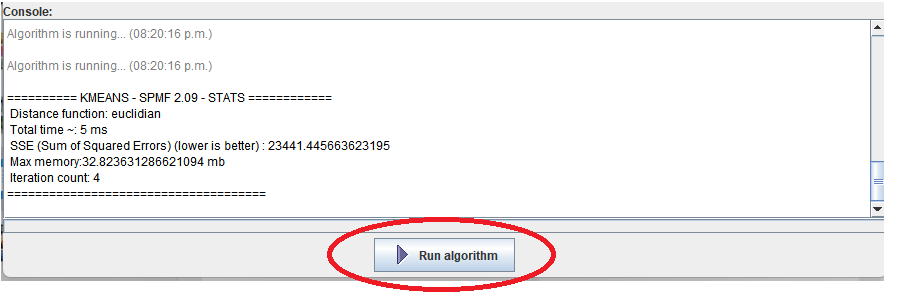
As usual, the conference proceedings of PAKDD are published in the Springer LNAI (Lectures Notes in Computer Science) series. As the number of papers has been increasing over the years, nowadays, the proceedings are published as six books:

The proceedings was made available on the conference website and was not given as a book or USB as it was done in the past. I assume that this is to be environmentally friendly, which is reasonable.
Acceptance rate at PAKDD 2024
This year, there was 720 submissions. From those 175 papers were accepted, including 133 and 42 for poster presentations. Thus, the overall acceptance rate is 23 %. The papers have been evaluated by a program committee consisting of 595 researchers.
Location
This year, the location is the city of Taipei, on the island of Taiwan. This city is a nice modern city, and the conference was held in the Taipei International Convention Center (TICC), which is well-located in the center of the city. It is also quite easy to access for the aiport. So, for this, it was a good location.

Workshops
At the conference, there was also six workshops on a variety of topics, including Fintech, affective computing, clustering, robust machine learning, temporal analytics, and pattern mining.
And in particular, I have co-organized the UDML 2024 workshop on Utility-Driven Mining and Learning (see my report about UDML 2024 here). At this workshop, we had an excellent keynote speech with Prof. Jian Pei:

The talk was about the role of data valuation in federated learning. A key point was that we cannot expect different actors to collaborate in federated learning if their own interests (e.g. in terms of money) are not taken into account. Some models were described to solve this issue.
Other activities
There was also an industry exhibition with several companies, which has been refreshing. Several companies were from Taiwan and using machine learning and data science techniques. There was also a company offering cloud services.
Some other interesting activities were the poster session, tutorials and keynote speeches. I have talked with several interesting people at the poster session. For the keynote speeches of the main conference, there was a keynote by a researcher from Google Deep Mind Ed H. Chi, talking about LLMs (Large Language Models). Another keynote was by Prof. Vipin Kumar about environmental data science. And another keynote by Prof. Huan Liu, also about LLMs.
Here is a picture of the poster session:

Social activities
The conference was on overall very well-organized. There was several social activities to allow researchers to talk together. On the first day, there was a welcome reception at the TICC in the evening:

There was also a tour of the National Palace Museum on the evening of the third day, followed by a banquet at the Silk Palace restaurant. Here is a picture from the banquet:

During the banquet, there was a good music performance, proposing music from around the world:

There was also a performance where some artist would draw different things using sand, such as this picture:

Several awards were also announced at the banquet. Here we can see Prof. Vincent S. Tseng, receiving the well-deserved Distinguished Service Award:

I also received the most influential paper award with my co-authors for a paper on sequential pattern mining that was published at PAKDD 2014 and received the most citations over 10 years from that year.


Some other important awards were given as follows:
- Distinguished Research Contribution Award: Jiawei Han
- Early Career Research Award: Yu-Feng LI
- Best Paper Award: Interpreting Pretrained Language Models via Concept Bottlenecks by Zhen Tan, Lu Cheng, Song Wang, Bo Yuan, Jundong Li, Huan Liu
- Best Student Paper Award: Towards Cost-Efficient Federated Multi-Agent RL with Learnable Aggregation by Yi Zhang, Sen Wang, Zhi Chen, Xuwei Xu, Stano Funiak, Jiajun Liu
It was also announced at the banquet that PAKDD 2025 will be held in Sydney, Australia:

That should be quite exciting. And there was some rumors that PAKDD 2026 might be in Hong Kong.
Conclusion
This was a brief overview of the PAKDD 2024 conference in Taipei. Hope you have enjoyed this blog post. Will be looking forward to PAKDD 2025.
—
Philippe Fournier-Viger is a distinguished professor working in China and founder of the SPMF open source data mining software.