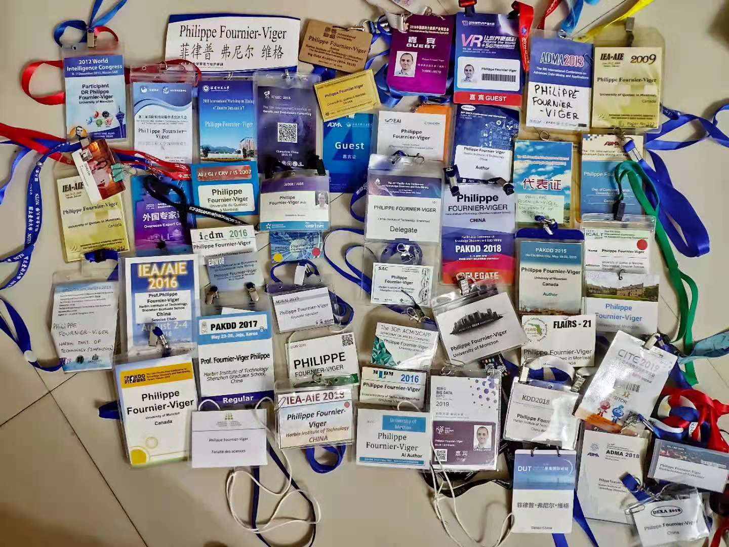
Today, I talk about my collection of conference badges that I have collected since I was a PhD student till today. I have attended over 50 events and have kept all of the conference badges except maybe one or two. Here is a picture of all these conference badges:
Totally, I have visited 28 countries and/or special territories but not all of them for attending conferences. Sometimes, it was only for a research visit or vacation. Below I will talk about what is a great conference badge and take a look at some of them to compare the different designs.
Generally, a good badge should have the following characteristics: (1) it is big enough, (2) the name is written in big letters, (3) it does not contain irrelevant information (e.g. it is unecessary to write the conference dates and hotel), (4) it is also beautiful, and (5) it cannot flip or otherwise it is printed on both sides.
The simple black and white badges
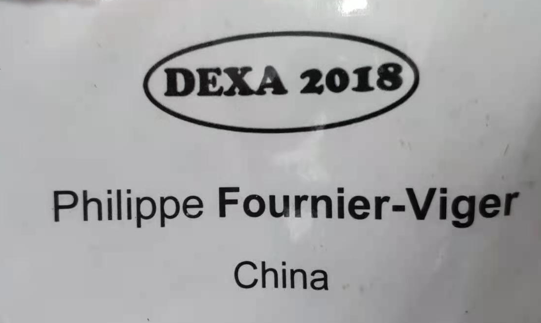
The badge below for DEXA 2018 is the most simple one. Printed on a piece of standard paper with a black and white printer, it only indicates the conference name, attendee name and country. Simple and effective. But could be more beautiful.
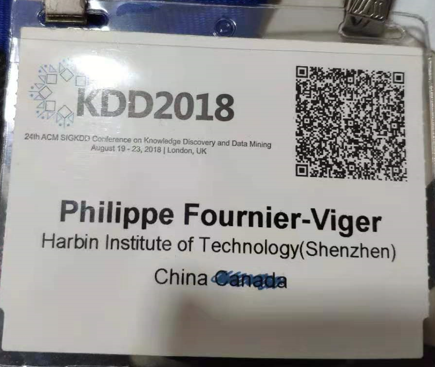
This is another simple black and white badge, for KDD 2018:
The simple badges with color
The badge below is still quite simple but has a bit more color which makes it more enjoyable than the black and white badges.
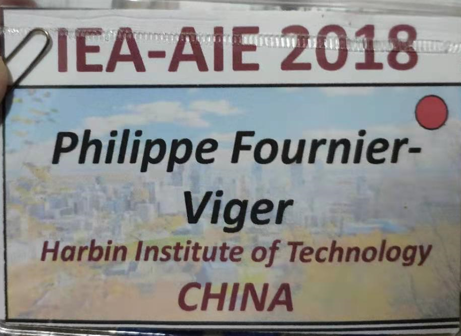
The one below is simple from IEA AIE 2018, colorful and effective as the key information is easy to read and big enough:
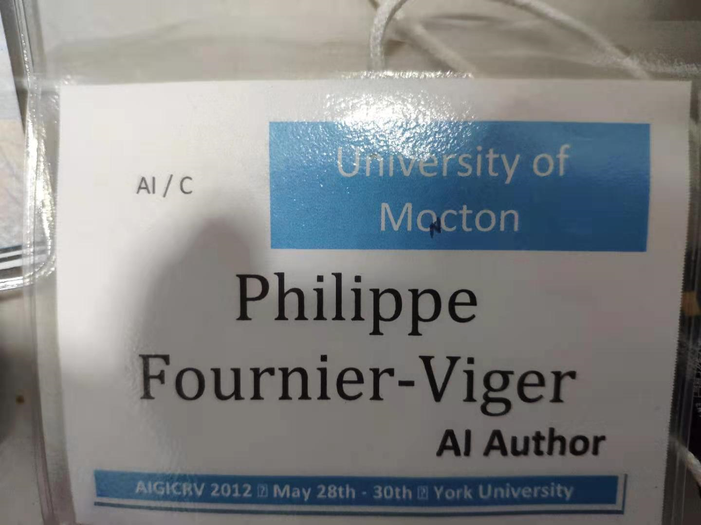
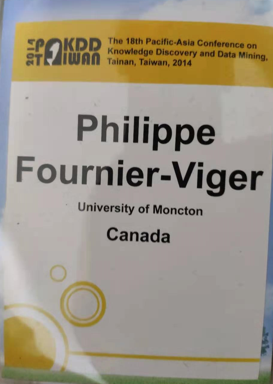
The one below from PAKDD 2014 is also quite good as the name is really big and the design is nice and colorful. However, there is a lot of empty space at the bottom. The bottom third of the badge could be cut entirely.
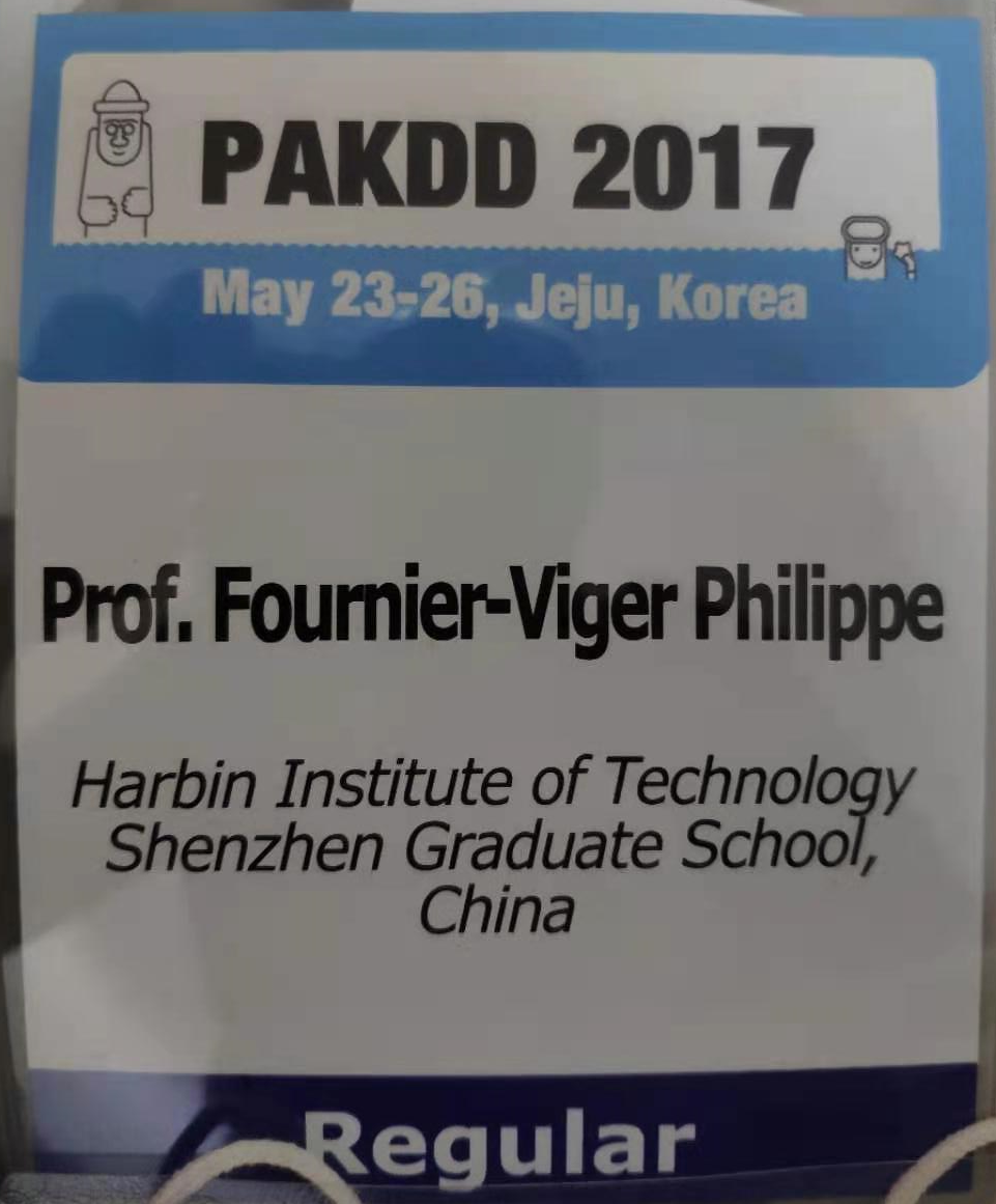
The one below from PAKDD 2017 is a bit better in my opinion as it is more beautiful. But the font for the name is a bit hard to read. Generally, it is better to put the first name bigger and to put the first name and the last name on different lines to avoid squeezing all letters on a single line like below.
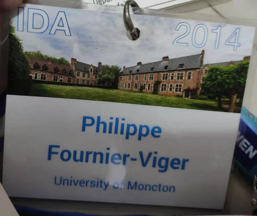
I like badges like the one below from IDA 2014 that are simple, colorful and just contain the key information (name, affiliation and conference acronym), and are also beautiful. That one uses a color picture which is nice.
Badges with text that is too small
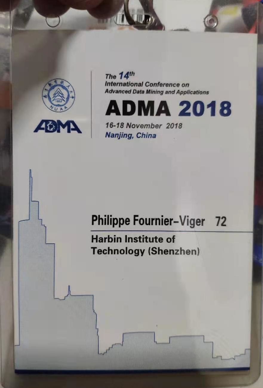
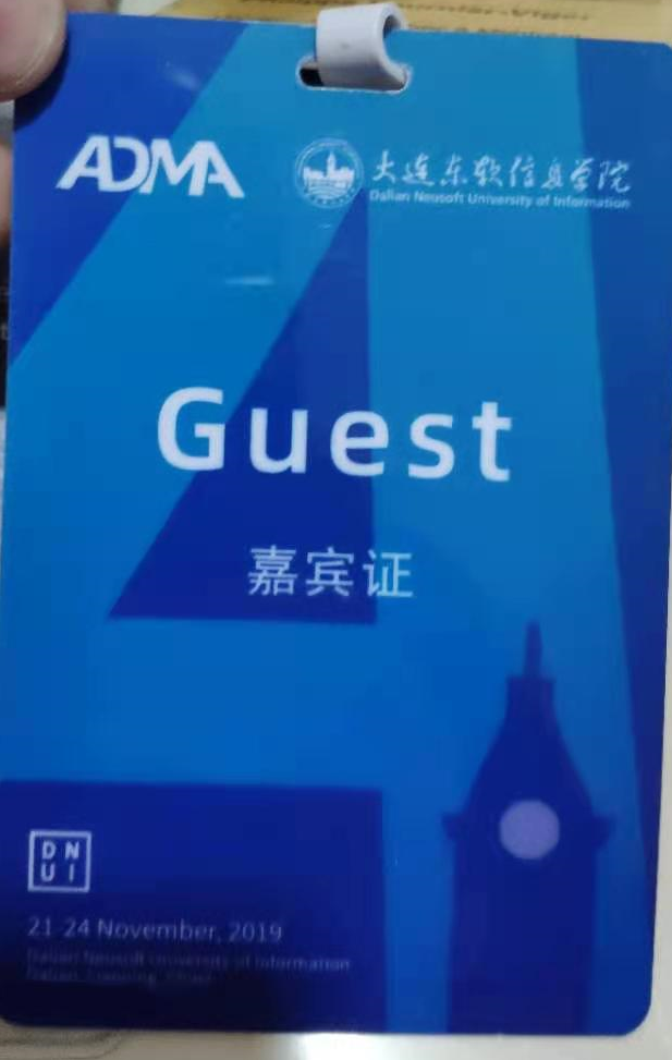
Some badge like the one below from ADMA 2018 are very big but do not use the space very well. The name of the attendee is actually very small. More than 50% of the space is basically empty.
Badge with too many information
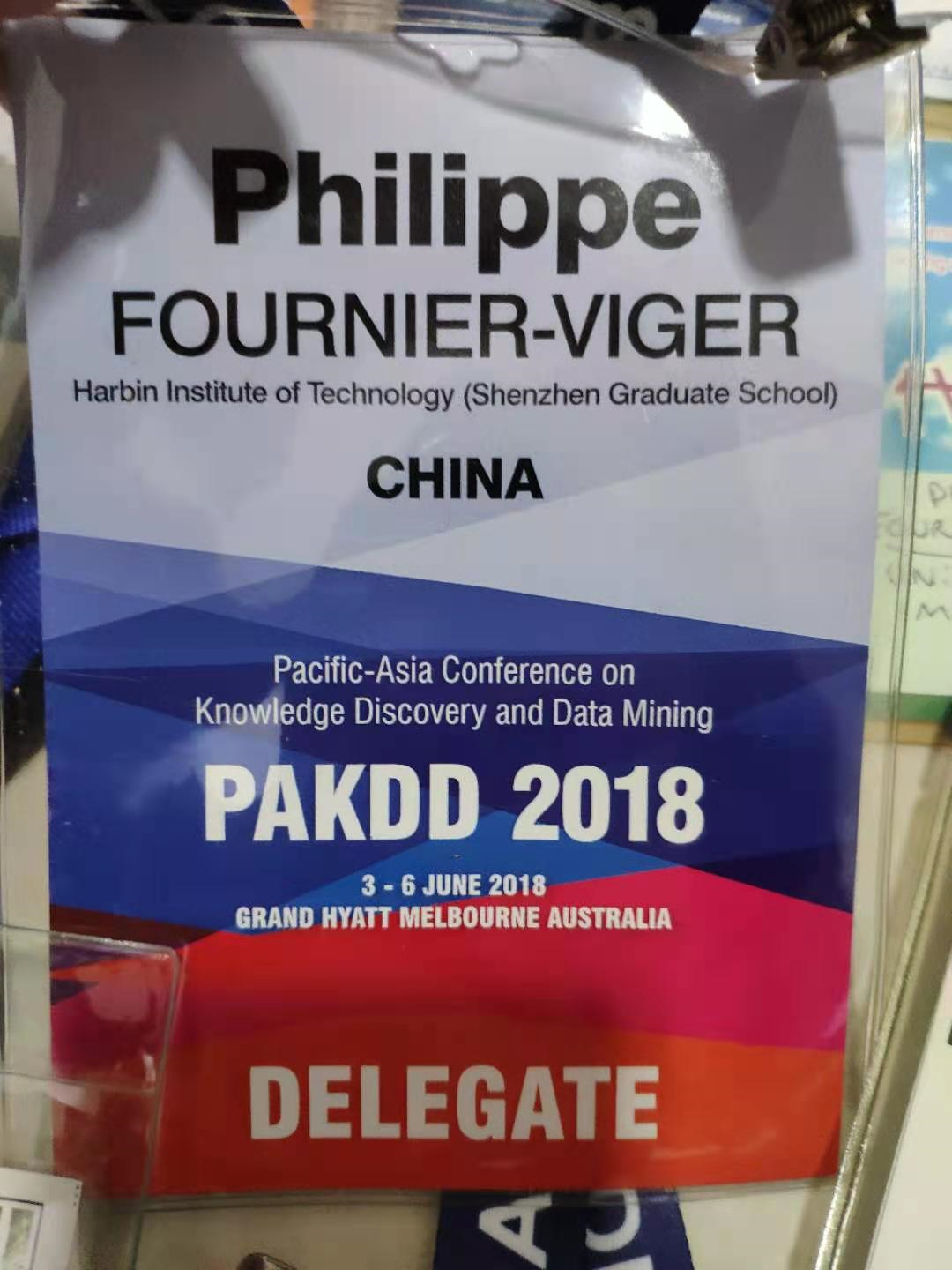
The badge below from PAKDD 2018 is beautiful but really contains too much information. It is not necessary for attendees of the conference to know the full conference name, dates, name of the hotel (!), and country. If we are attending the conference, we already know at which hotel we are and what is the date.
Badges where you write your name by yourself
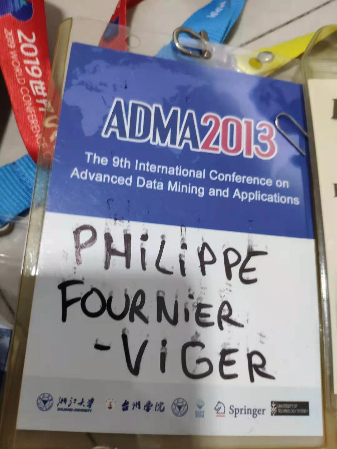
For some conferences, I had to write my name by myself. This is not a very good idea… Look at the messy result below when the ink does not dry well at ADMA 2013!
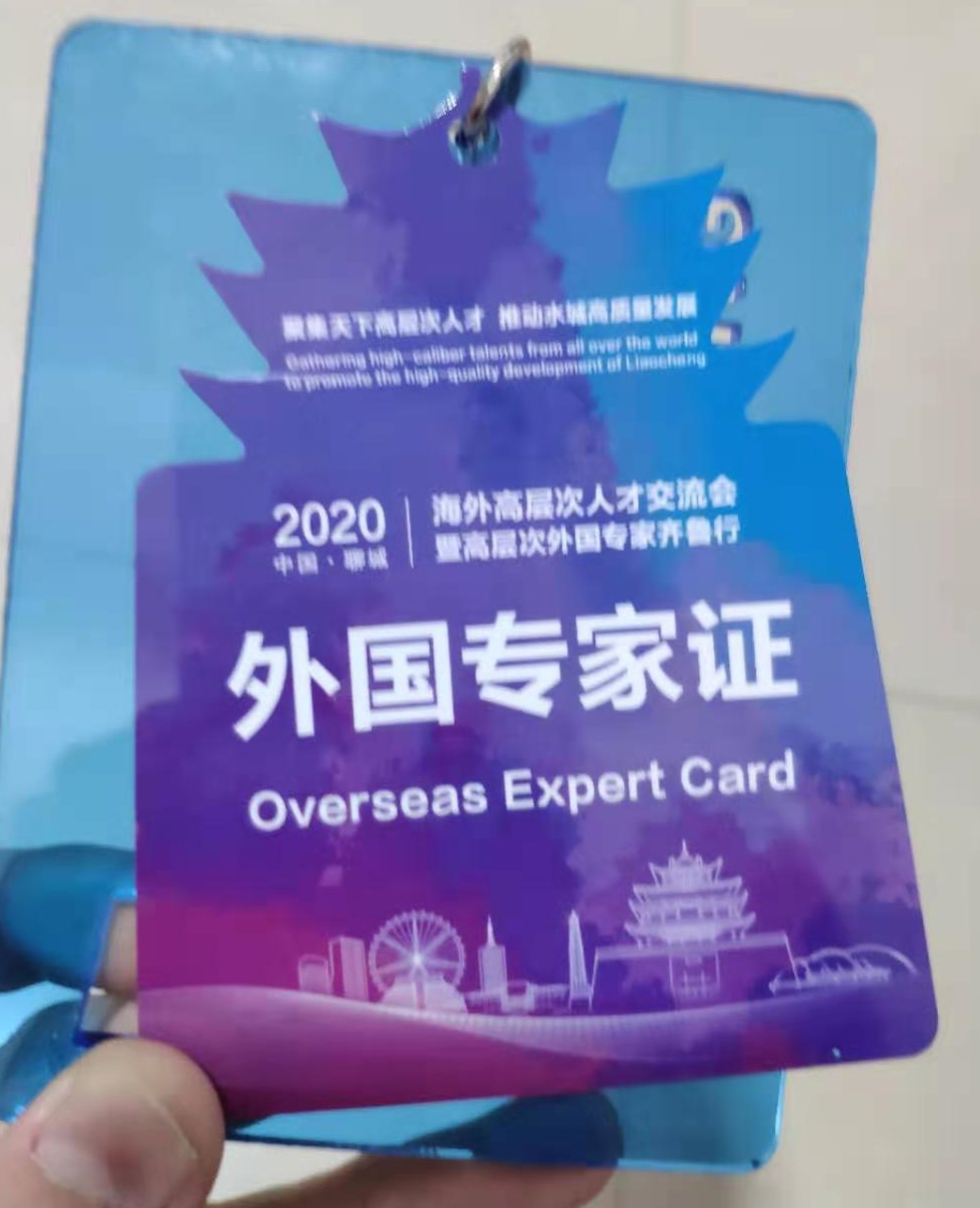
Badges with a fancy design
The badge below is one of my favorite as it is made of plastic and has a very beautiful design representing the architecture of a famous tower in the city (Liaocheng). It could have been improved by adding the names of attendees.
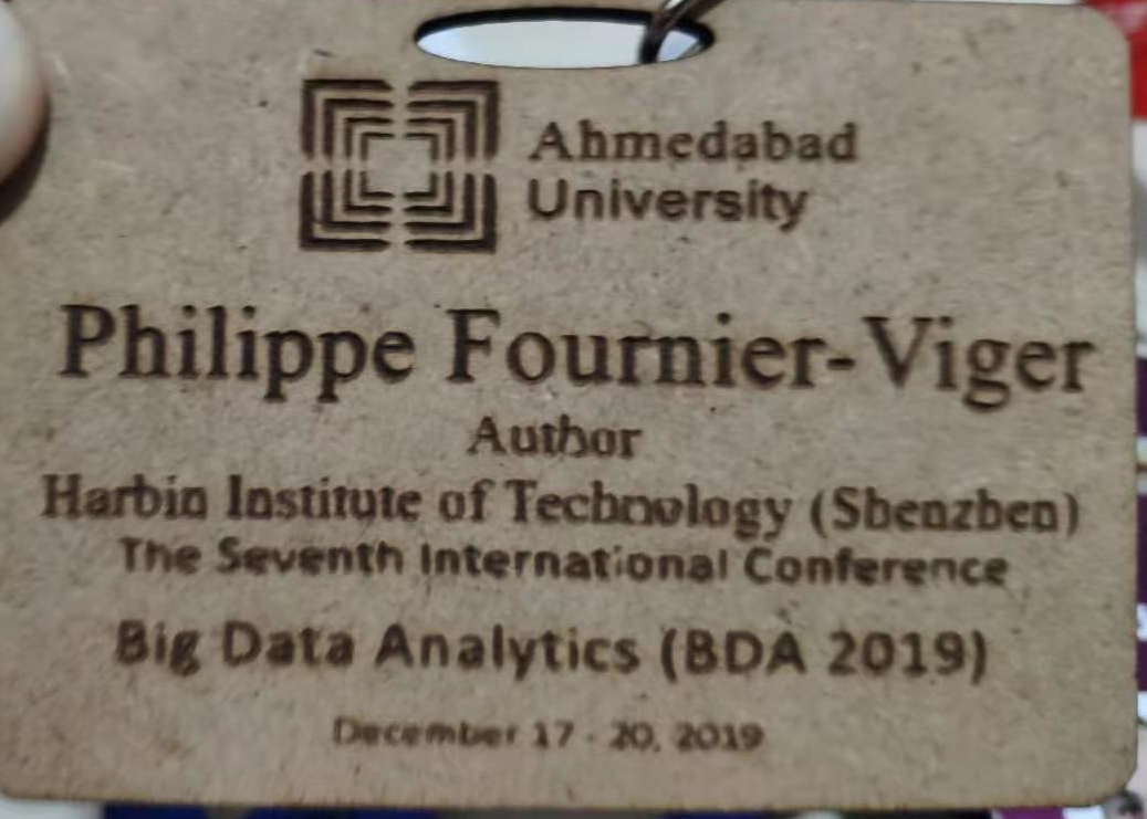
Badges with a special material
Another badge that is quite special is the one below for the BDA 2019 conference as it has been etched in a piece a wood. That is the most unique material for a conference badge that I have seen, and for this it is really nice. However, I think that some information could be removed like the full conference name and dates. Just writing BDA 2019 would be enough and would make it easier to read.
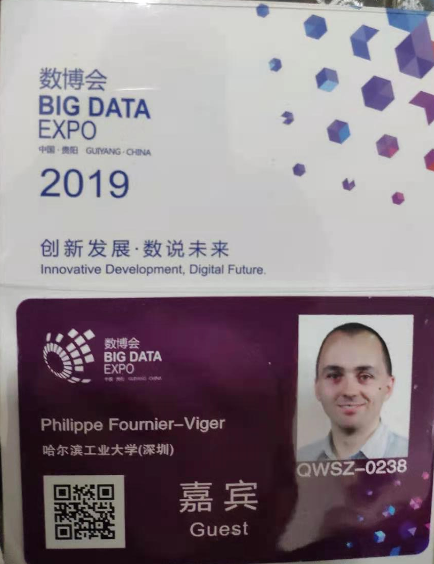
Badges with photo
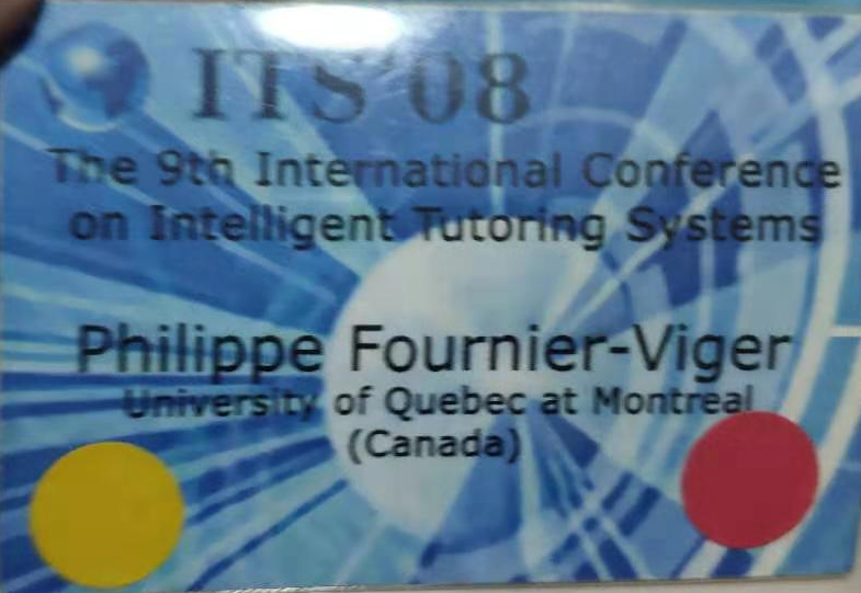
Badges for some events also havea photo. Below is an example. Having a photo is nice and probably also a security measure to ensure that the badge is not stolen and used by someone else.
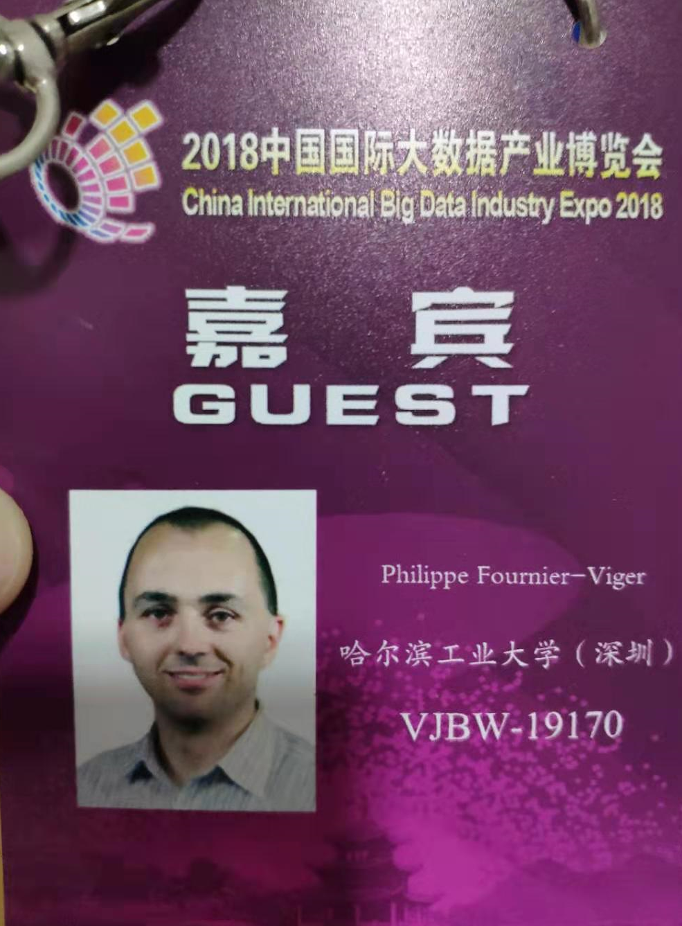
Another badge with photo is below. This one is really nice but a problem is that the name is really small.
The badges with no names
A few conferences have given badge with no names like below. Although I have enjoyed these conferences, I have to say that having a name on the badge would have been much better. It is important to help starting conversations with other attendees!

Badge with text that is too small and too many colors
And the following badge is one of the worst (in my opinion). The problem with this badge is that it is really small (smaller than a credit card) and that the text is really hard to read because of the colors. At that time I was a graduate student and I had printed these badges and helped to do the design so I am partly responsible for that! What happened is that we first bought paper for badges that were too small and did not know how it would look like when printed in color. Also, I had no experience in designing badges and we were in a rush, so we did not had time to print them again. Today, I would not do like that 😉
But I also did the design of that badge at the same time and it looked a bit better:
Conclusion
In this blog post, I have talked about how a good conference badge should be designed and have shown some of the best and worst badges from my collection. 😉
Do you also keep all your conference badges? Which badge do you like the most or think is the worst? You may tell me in the comment section below.
—
Philippe Fournier-Viger is a full professor working in China and founder of the SPMF open source data mining software.