
Today, I will continue to show you some upcoming features of SPMF 2.60, on which some work is ongoing. This new version of SPMF should be released in the coming weeks. The new feature that I will talk about today is the Timeline Viewer. It is a powerful tool for visualizing temporal data. Let me now show you this in more details.
The Timeline Viewer can first display event sequences, which are files taken as input by episode mining algorithms, among others. For example, we can use the TimeLineViewer to see a visual representation of this input file:
@CONVERTED_FROM_TEXT
@ITEM=1=apple
@ITEM=2=orange
@ITEM=3=tomato
@ITEM=4=milk
1|1
1|2
1 2|3
1|6
1 2|7
3|8
2|9
4|11
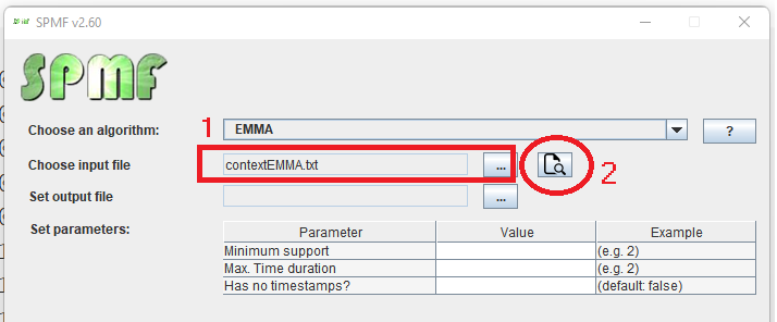
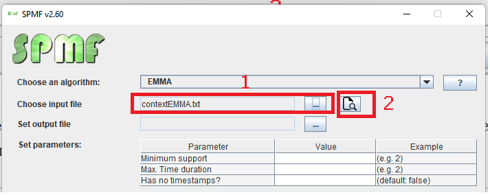
To do that, we first select the input file “contextEMMA.txt” using SPMF (1) and then click on the new “view dataset” button (2):
This open a table representation of the dataset:
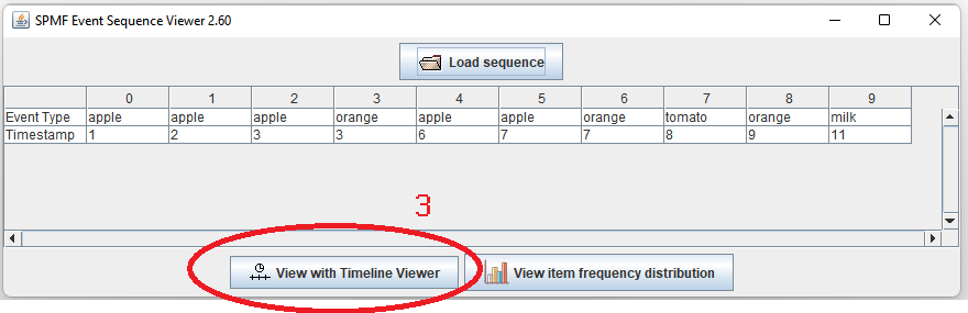
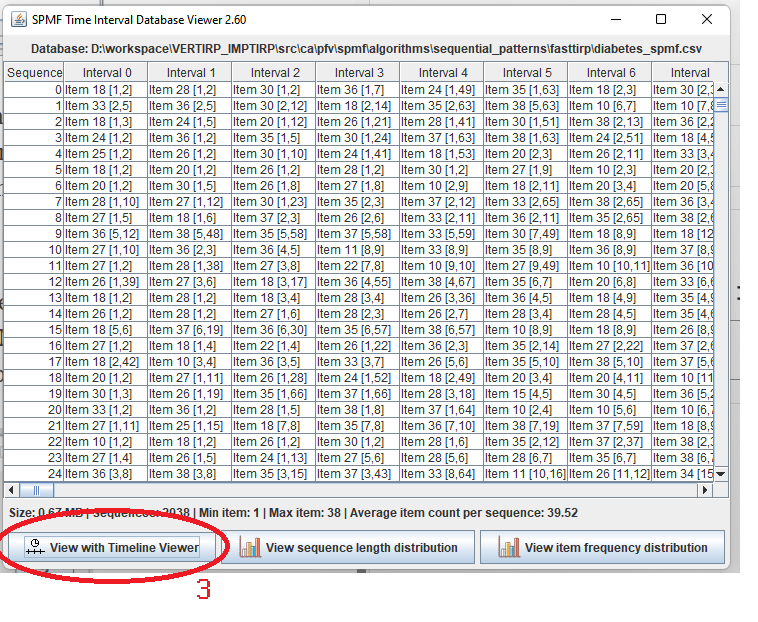
Then, we click on the “View with Timeline Viewer” button (3) to see the visual representation:
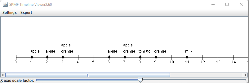
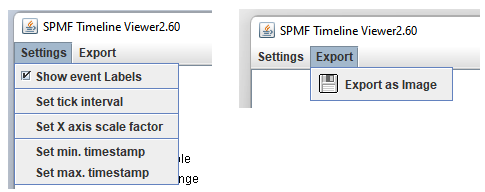
The Timeline Viewer provides several options such as exporting to image, changing the tick interval, and the minimum and maximum timestamps, as well as applying a scaling ratio on the X axis. Moreover, the Timeline Viewer has a built-in custom algorithm to automatically determine the best parameters to ensure a good visualization. Here are some of the options available:
The second feature of the Timeline Viewer is to view time-interval datasets such as those taken as input by the FastTIRP and VertTIRP algorithms (to be released in SPMF 2.60). To use this feature, we again select an input file (1) and click on the “View dataset” button (2) :
Then, we obtain a Table representation of the dataset and click on the “View with Timeline Viewer” button (3) to see the visual representation:
The result is like this:
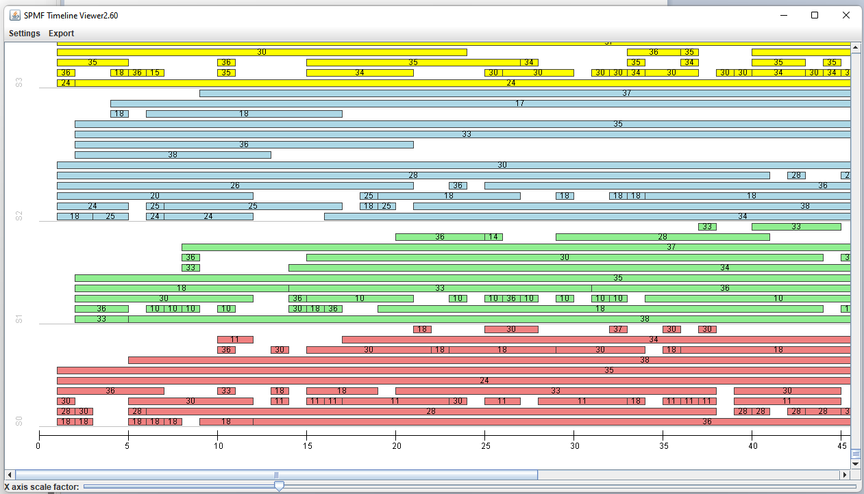
At the bottom, we have the timeline. On the left side, we can see the sequence IDs (S0, S1, S2, S3…) and we can see the time intervals from each sequences depicted using a different color for easier visualization. We can also adjust various parameters to customize the visualization and export the picture as a PNG file.
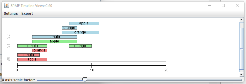
Here is another example with a smaller data file containing three time interval sequences:
OK, so that’s all for today. I just wanted to give you a preview of upcoming features in SPMF. Hope that it is interesting. There are still some bugs to be fixed and other improvements to be made, so that feature may still change a bit before it is released.
By the way, the Timeline Viewer is completely built from scratch to ensure efficiency (which is an important design goal of SPMF). Building a time line viewer was quite challenging. There are many special cases to consider and tricky aspects to ensure a good visualization.
If you have any comments or suggestions about this feature or what you would like to have in SPMF, please leave a comment below or send me a message.
—
Philippe Fournier-Viger is a distinguished professor working in China and founder of the SPMF open source data mining software.