Today, I discovered an interesting function of DBLP which is to draw your social network as a graph (assuming that you have a DBLP page). To use that feature, it is simple. Open your DBLP webpage, and then click here at the bottom of the page:
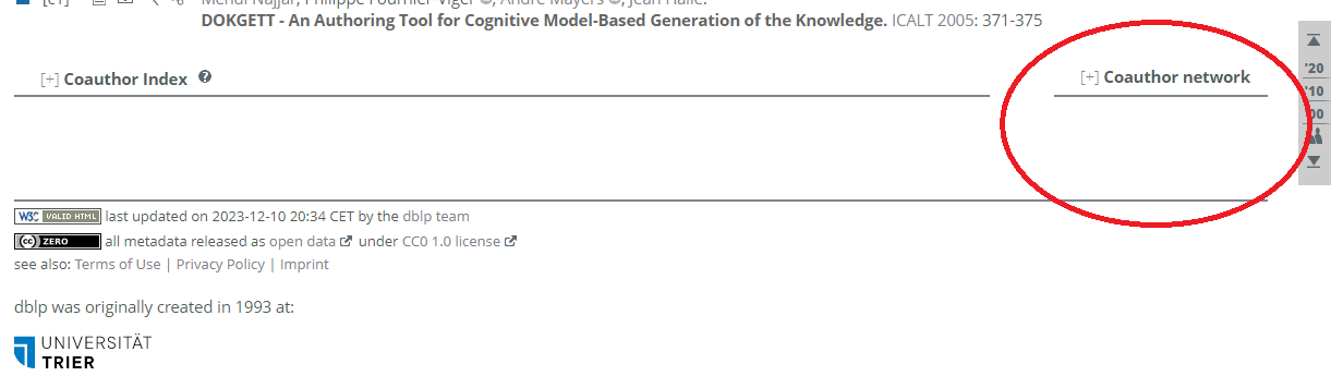
Then, your social network will be displayed (it can take a little while). For example, this is mine:
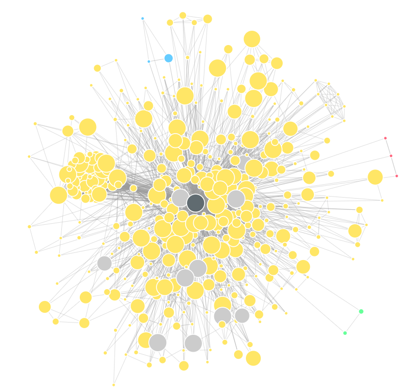
What is interesting is that it shows not only the direct co-authorship links, but also some transitive links thus highlighting some potential connections that one could create through his current network.
In the above picture, the graph is quite dense since I have 390 co-authors on DBLP.
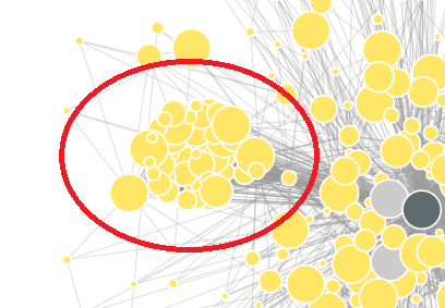
By observing this graph, we can also see some strange structures like this one:
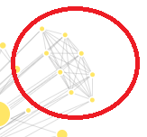
This structure seems too perfect (all the authors are connected between themselves). Thus, I have investigated why. The reason is simple. It is a paper that I participated in, where there was 8 authors and most of them were not from computer science. Thus, most of the authors on that paper had only one paper on DBLP, which was the same.
There is also a dense cluster here:
which is mostly European researchers.
I just wanted to share this interesting function with you in this blog post, as I have discovered it today (but it might have been available for a while!).