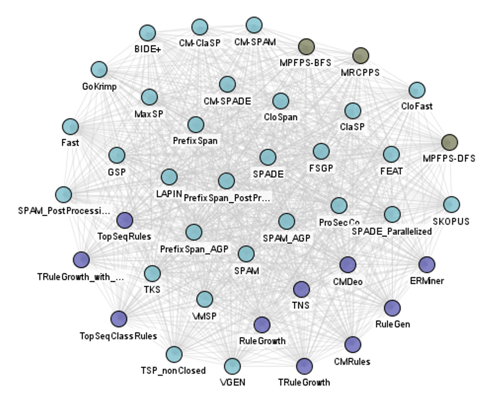
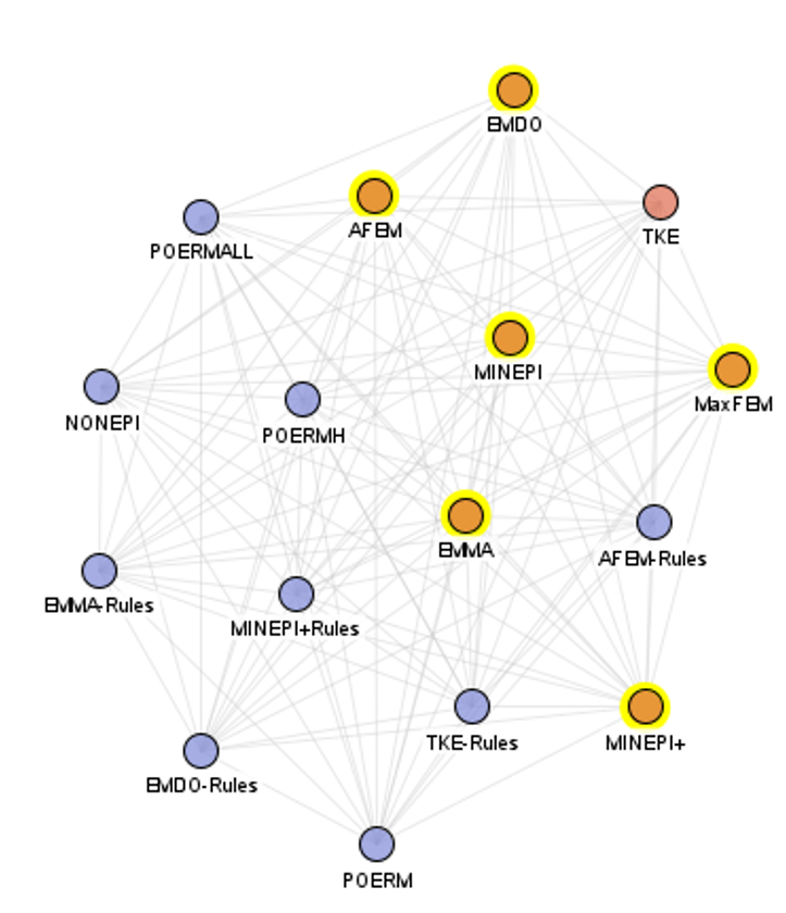
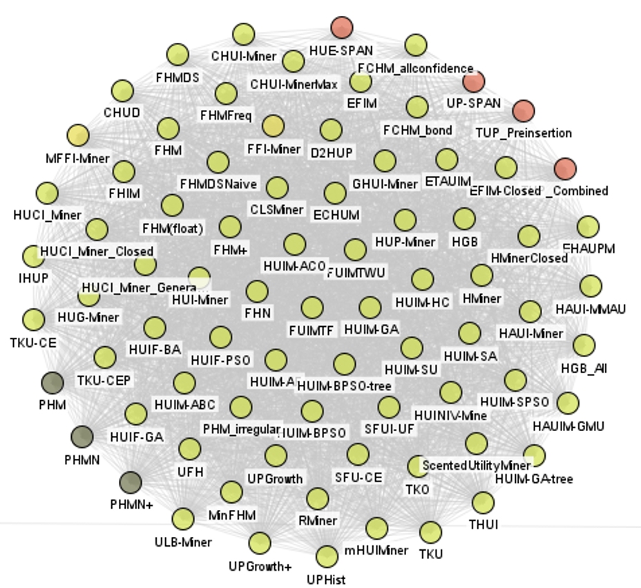
Today, I wrote some code to visualize the relationships between the algorithms offered in the SPMF open-source pattern mining library. Here is the graph of all algorithms in SPMF (excluding tools) that have the same input and output type:
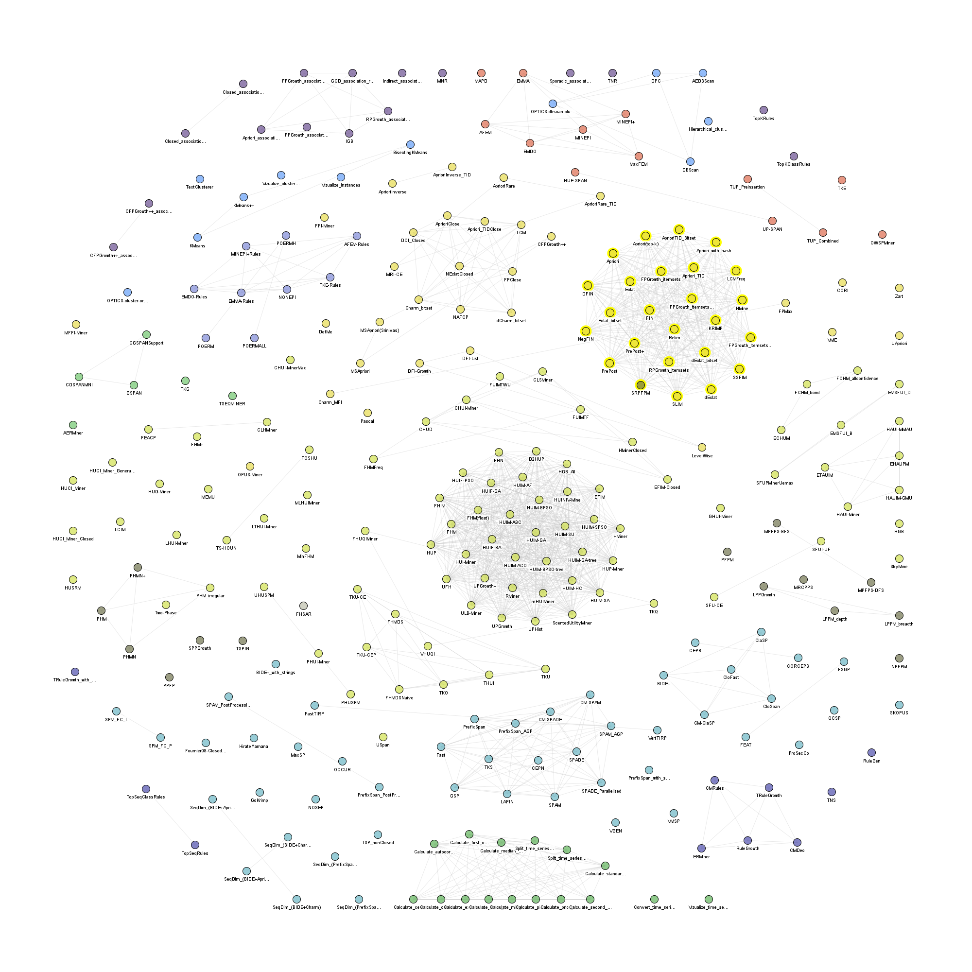
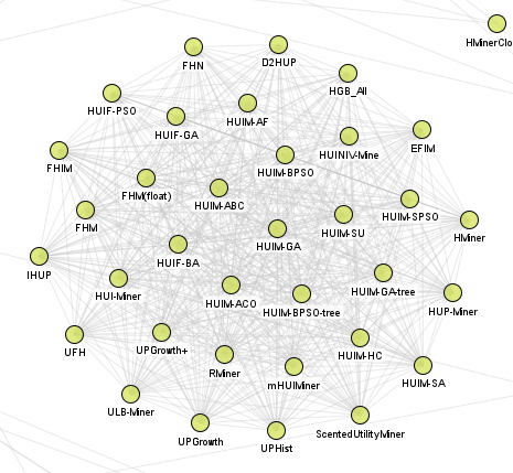
We can see a few big clusters such as high utility itemset mining algorithms:
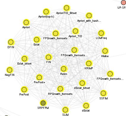
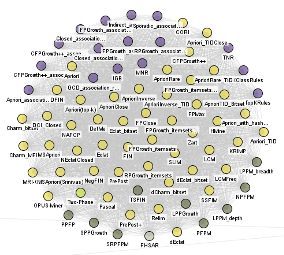
Frequent itemset mining algorithms:
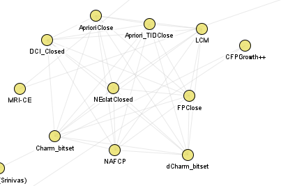
Closed itemset mining algorithms:
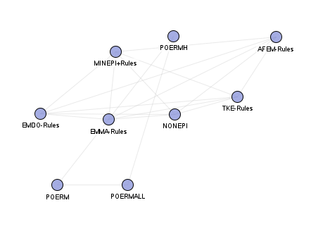
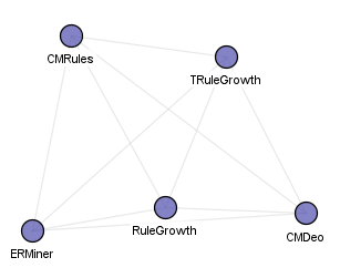
Episode rule mining algorithms:
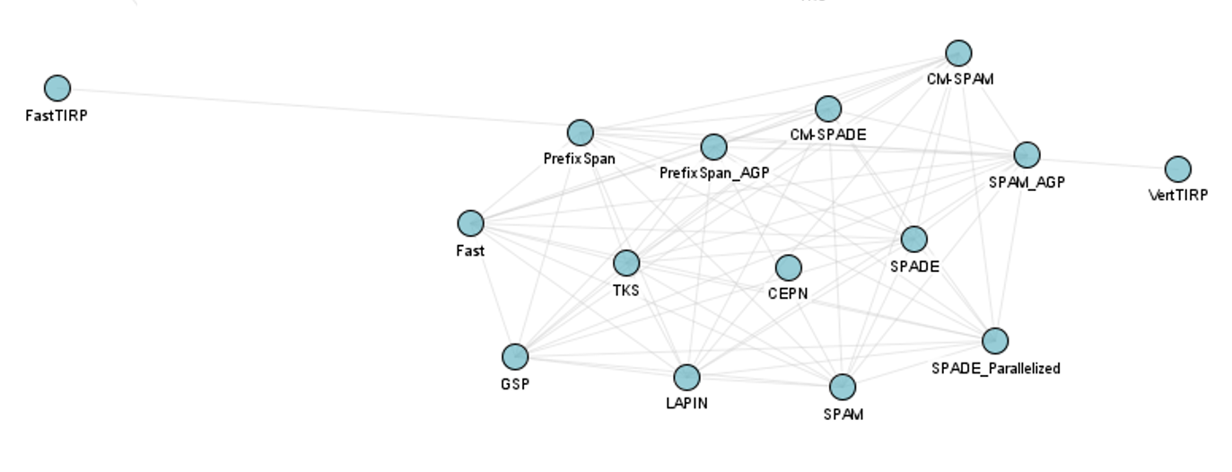
Frequent sequential pattern mining algorithms:
Sequential rule mining algorithms:
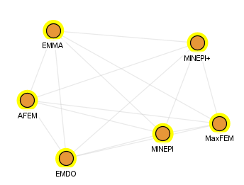
Frequent episode mining algorithms:
If we only display the algorithms using edges if they have the same input file type (but may not have the output), the graph is different:
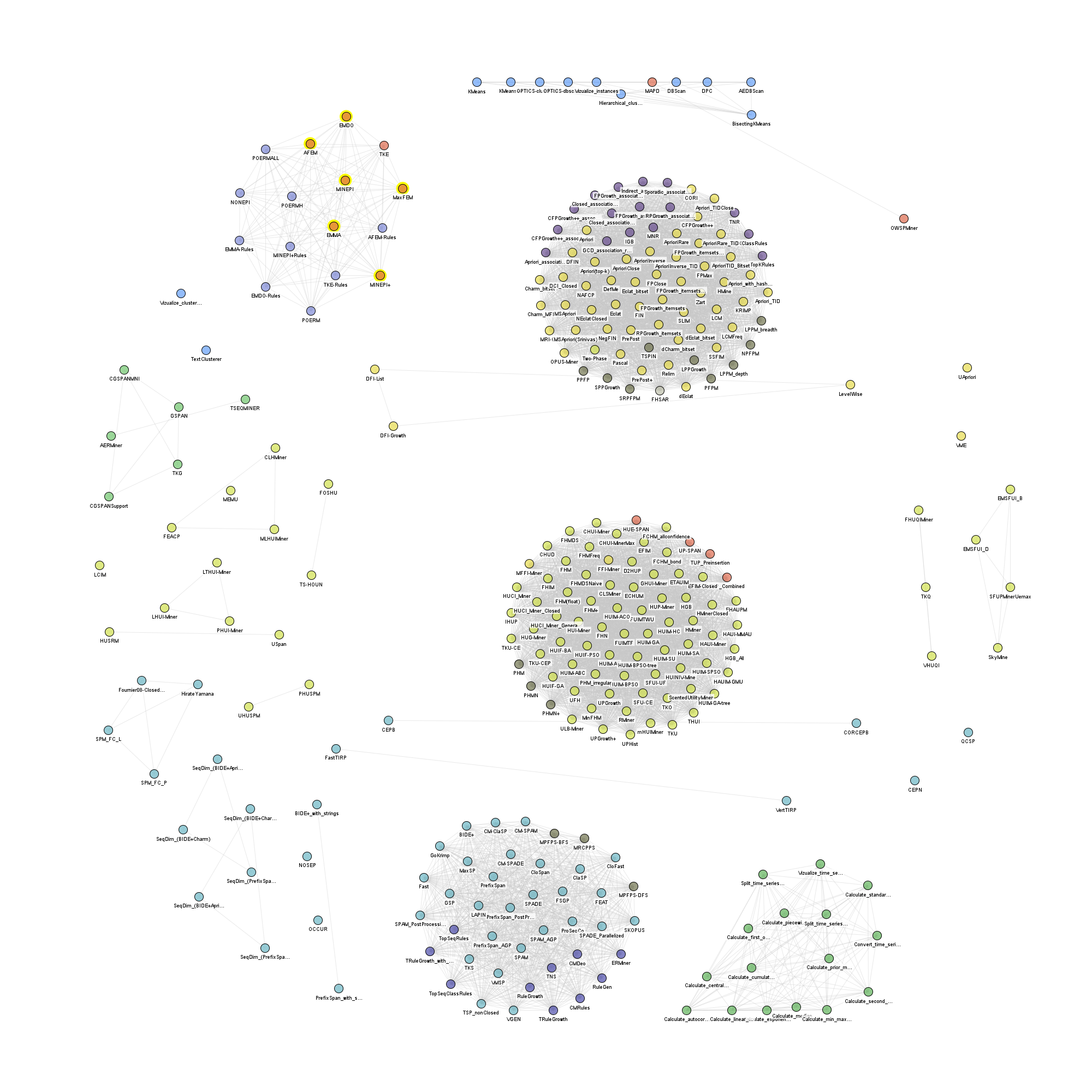
Now, there is a huge cluster for itemset mining and association rule mining:
And there is a big cluster for sequence mining algorithms:
And a smaller cluster for episode mining:
and a big cluster for high utility pattern mining:
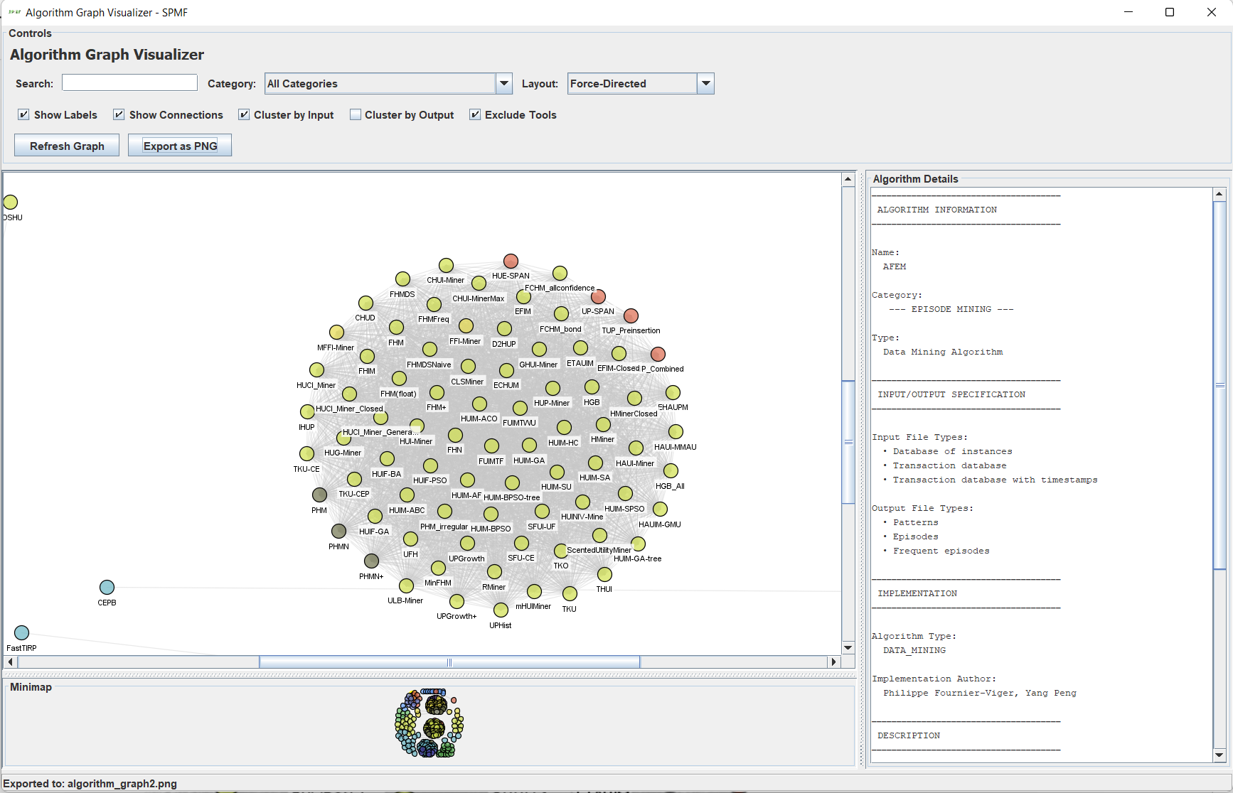
The tool that I use to draw these pictures is the AlgorithmGraphVisualizer, a new GUI tool, which will be offered in the next version of SPMF. It allows to visualize algorithm relationships with different options and export to PNG. Here is the current GUI interface:
Hope that this has been interesting! The new version of SPMF should come out probably next week!